The World Of Twilight
March 29, 2024, 09:27:35 am *
Welcome, Guest. Please login or register.

Login with username, password and session length
News: Welcome to the World of Twilight forum!
Automatic registration has been disabled, but if you are new and wish to register then just send me an email (m.thorp@talk21.com) and I'll sort it out. Don't forget to say what username you would like!
 
Pages: [1]
  Print  
Author Topic: Help! Poster designs...  (Read 7507 times)
Carcharoth
Twilight Creator
Administrator
Distinguished Engineer
*****
Posts: 2640


« on: April 10, 2011, 01:07:03 pm »

Hi all!

I'm getting one of those big roll-out posters done for Salute this year so I've been working on the art and would love it if you could have a quick look and let me know what you think.


It'll be two meters tall, so a fair size really!

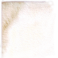
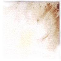
A big question is on the colours - my laptop isn't great for checking colours, and I'm also a tad colourblind Embarrassed
The back is meant to be cream, but I'm concerned it's got a pinkish tinge at the moment...
Logged
Lost Egg
Lord of Engu
Administrator
Distinguished Engineer
*****
Posts: 989


« Reply #1 on: April 10, 2011, 04:13:42 pm »

Colours look good to me. The knight seems to stand out a bit, is he in black? If so maybe have his linework in a dark brown so he melds better. I'm loving the overall design though.

HN
Logged
Jubal
Engineer of Larigal
Qualified Engineer
****
Posts: 331


WWW
« Reply #2 on: April 10, 2011, 08:15:25 pm »

I really like it, the knight does stand out but that makes it more eyecatching at a distance.
Logged

WoT Reporter and editor of A Call To Arms.

Geckilian
Hunter of Orelan
Distinguished Engineer
*****
Posts: 509


NuraSen'Malog


« Reply #3 on: April 10, 2011, 08:22:53 pm »

I asked a few people using my computer screen and iPad, and the general consensus was yes, it's a little pink (but only just). No one minded it though, as it ties it in to the rest of the poster in terms of overall tone anyway. I quite like the black Knight, but a Strider would have been much, much better.

(Speaking of which, email about this sent, and if you ever decide to make a monochrome Delgon one...)
Logged

Jubal
Engineer of Larigal
Qualified Engineer
****
Posts: 331


WWW
« Reply #4 on: April 10, 2011, 08:40:57 pm »

But then again we don't want Brandlin boycotting the stand at the last minute.  Wink
Logged

WoT Reporter and editor of A Call To Arms.

Carcharoth
Twilight Creator
Administrator
Distinguished Engineer
*****
Posts: 2640


« Reply #5 on: April 11, 2011, 10:26:31 pm »

Here you go, the final version.
Let me know if you think I've done anything majorly wrong, but it's going off to the printers tomorrow after lunch... Hope you like it!

I've shown it alongside the original so you can see what I've changed. I had to start again from scratch as the original corrupted. Please don't tell me if you think the original was better  Wink

Logged
Geckilian
Hunter of Orelan
Distinguished Engineer
*****
Posts: 509


NuraSen'Malog


« Reply #6 on: April 11, 2011, 10:34:59 pm »

Oh excellent, much nicer than the original, especially as all 3 factions (so far) are represented. It'll be good to see it in person.
Logged

Brandlin
Official Fubarnii Architect
Distinguished Engineer
*****
Posts: 762


WWW
« Reply #7 on: April 11, 2011, 10:45:04 pm »

nooooooooooooo


You put a strider on the poster!!!

Bad bad man.
Logged

Brandlin - Home of Laser cut styrene building kits - NOW OPEN!

"Engineers are too precious a resource to let go wandering the open countryside" - Emberbreeze 9/11/11
Lost Egg
Lord of Engu
Administrator
Distinguished Engineer
*****
Posts: 989


« Reply #8 on: April 12, 2011, 06:54:12 am »

Looks awesome. I think the changes you made really make it fit in with the style you have put into the rulebooks and having a figure from each of the peoples is a nice touch.

HN
Logged
Ben Brownlie
Colouring In Bloke
Development Team
Senior Apprentice
*
Posts: 167


« Reply #9 on: April 12, 2011, 10:04:27 am »

The colours and proportions are much better on the second one, tho I'm not sure about all three factions needing to be on there

I still like the simple line drawing of the knight

But on the second layout

Just to be difficult...
Logged
Emberbreeze
Development Team
Senior Apprentice
*
Posts: 200


« Reply #10 on: April 12, 2011, 10:14:30 am »

I think the Ink drawing stands out better (good for drawing people in), but the pencil sketches are more in keeping with the style of the game (the ink drawing is a bit cartoony). So I'm not sure which is better.
Logged

Pages: [1]
  Print  
 
Jump to:  

Powered by MySQL Powered by PHP Powered by SMF 1.1.11 | SMF © 2006-2009, Simple Machines LLC Valid XHTML 1.0! Valid CSS!